
Exploring Visual Identity: The Story Behind Huel's Unused Brand Symbol

Back in 2018, we were working on a brand update project for our client, Huel. They were quite happy and proud of the brand logotype that we designed for Huel and the recognition it had gained. However, they voiced they needed a simpler brand symbol for specific applications.

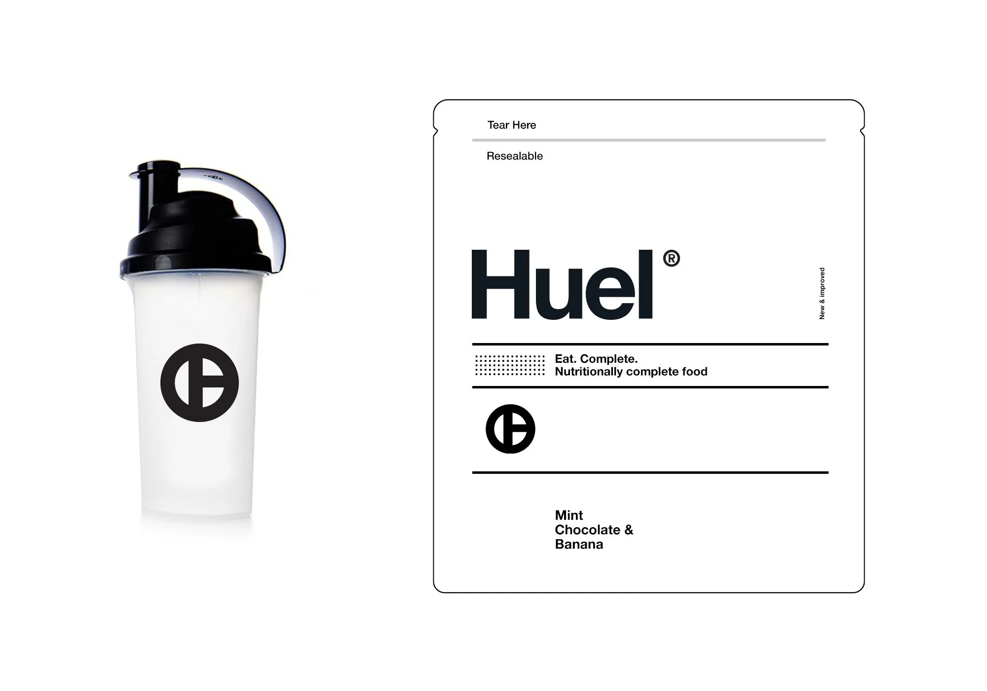
Taking that on board, we iterated on a new exploration. We framed the 'H' letter in Huel's logotype within a circle. The result was a strong, compact symbol that distilled Huel's identity into a single graphic mark.
The team loved it, and we felt it added a new dimension to the Huel brand!
Despite its potential, the client decided to stick with their logotype for the time being. Our proposed symbol was put on the back burner, saved perhaps for a future time when it might be resurrected and incorporated into Huel's brand identity.
The story serves as a reminder of the fluid and often unpredictable nature of design work. Even though this exploration didn't make the final cut, it is a piece of our creative journey with the Huel brand.
Who knows? Maybe one day, we'll see this strong visual element become part of Huel's identity.
Stay tuned for more stories from our design journey!